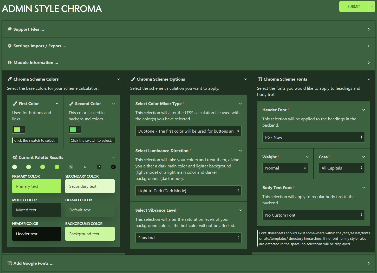
Using the color selectors, you can select the first color - your main color - and a second color if you wish - your accent color. Only the first color is required. The default color scheme installed by the module is a grayscale dark mode theme.
Your main color does not got modified and gets applied to principal interface elements. If you are currently using the rock.less style as your admin style, this color gets applied to the @rock-primary LESS variable.
Your second color gets desaturated.
In the background, depending on your mixer type either one or both of your color selections will be calculated and applied to eight master colors. These colors are displayed here.
Your first color choice is applied without any modifications to palette color 3.
Your second color choice (when applicable) is desaturated and treated according to your mixer type selection and applied to palette color 6.
In general, colors 1-4 are applied to interface elements and their hover states. Colors 5-8 are applied to backgrounds and muted states.
You can read more details about it in the ProcessWire Modules Directory.